VISUAL IDENTITY / STRATEGYSupreme Realty
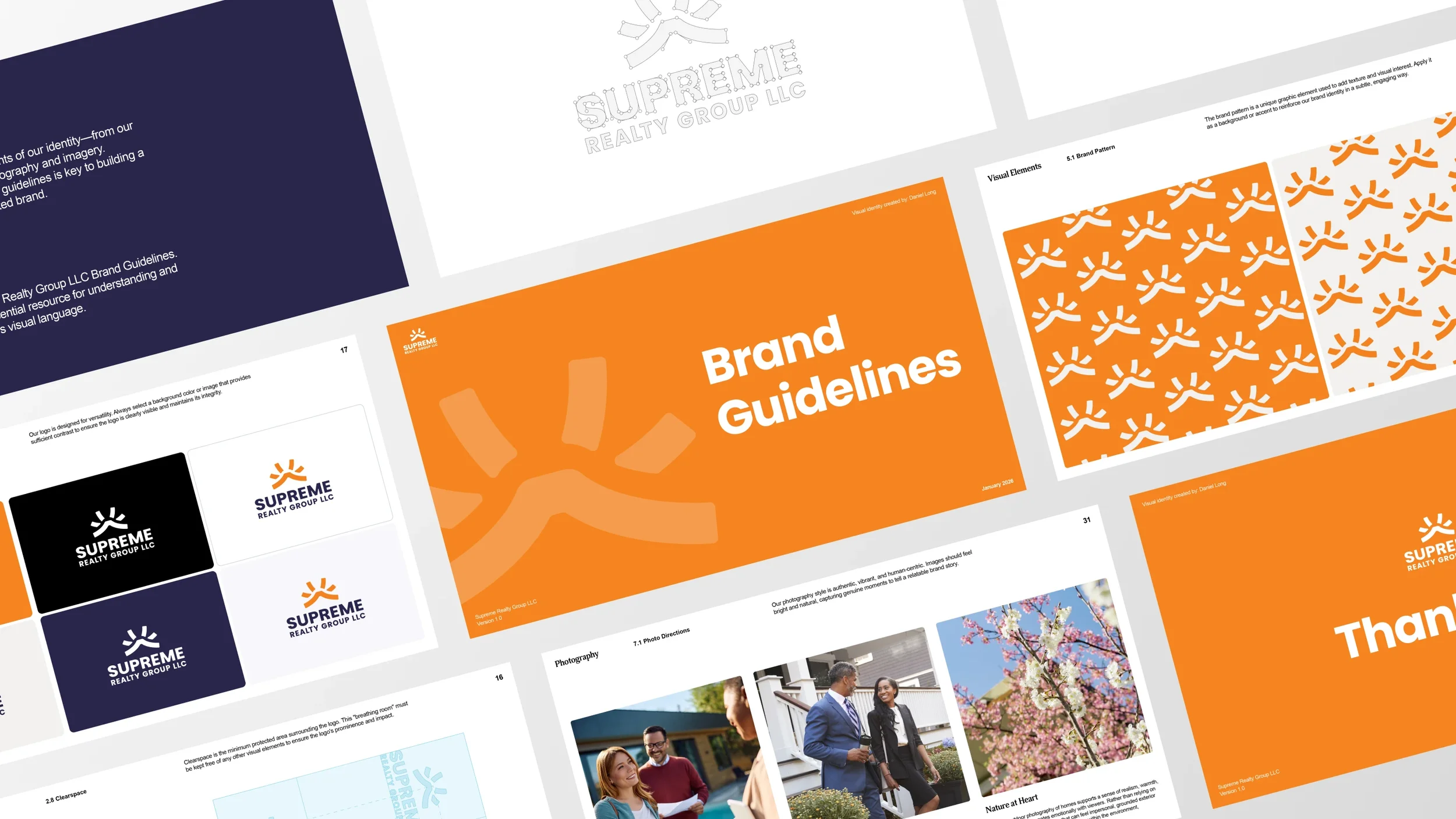
Founded in the 1970s, Supreme Realty Group LLC had built decades of reputation the traditional way: word of mouth, repeat clients, and a steady stream of five-star local reviews. What it never had was a brand. I was brought on to establish a visual identity system. I delivered a brand identity, social and presentation templates and print assets.
-
Led brand strategy sessions with company leadership to define core values and positioning.
Conducted competitive research across the Portland real estate market, including Zillow, Redfin, and Own It Northwest.
Designed the primary logo mark and full identity system, including color palette, typography, and supporting visual language.
Presented concepts and rationale to the client across multiple review rounds, incorporating feedback while protecting the strategic intent.
Built out brand guidelines to ensure consistent application across print, digital, and marketing collateral.
-
Translating 50 years of informal, review-based reputation into a formal visual identity with no existing brand foundation to build from.
Client hesitation during initial concept review, including a preference for a literal house icon that risked diluting the mark's distinctiveness.
Standing out in a market saturated with red, white, and blue "corporate polish" without resorting to the regional cliché of green.
Balancing a design that felt both familiar and comforting to a millennial-skewing audience while still differentiating from major national competitors.
-
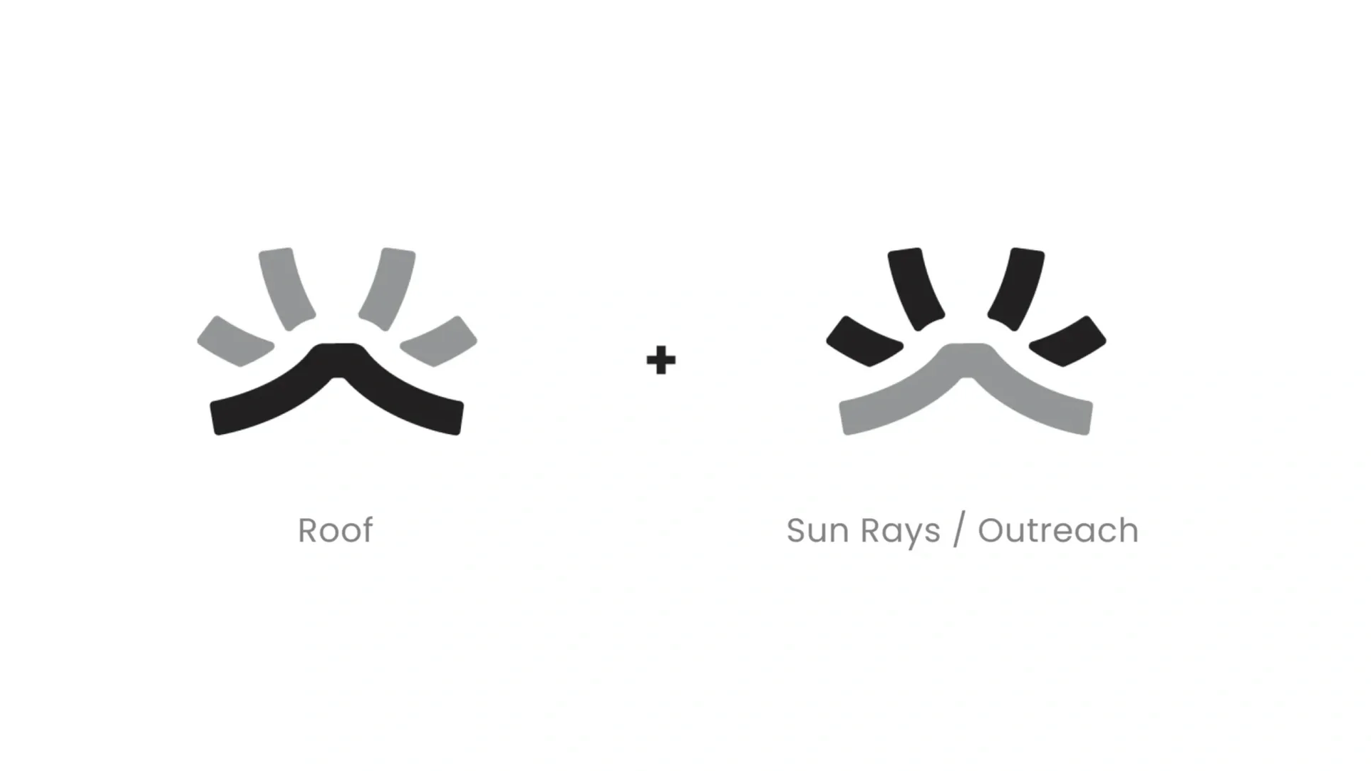
Delivered a distinct, ownable logo mark combining an abstract roof and sun ray motif, unlike anything else in the local competitive set.
Established a full identity system (color, typography, imagery direction, templates, print assets) that gave the company a consistent, scalable visual presence for the first time in its history.
Positioned the brand to compete visually and strategically against national platforms while retaining its local, trust-driven identity.
Equipped the client with brand guidelines to maintain consistency as the company scales.
Inspiration
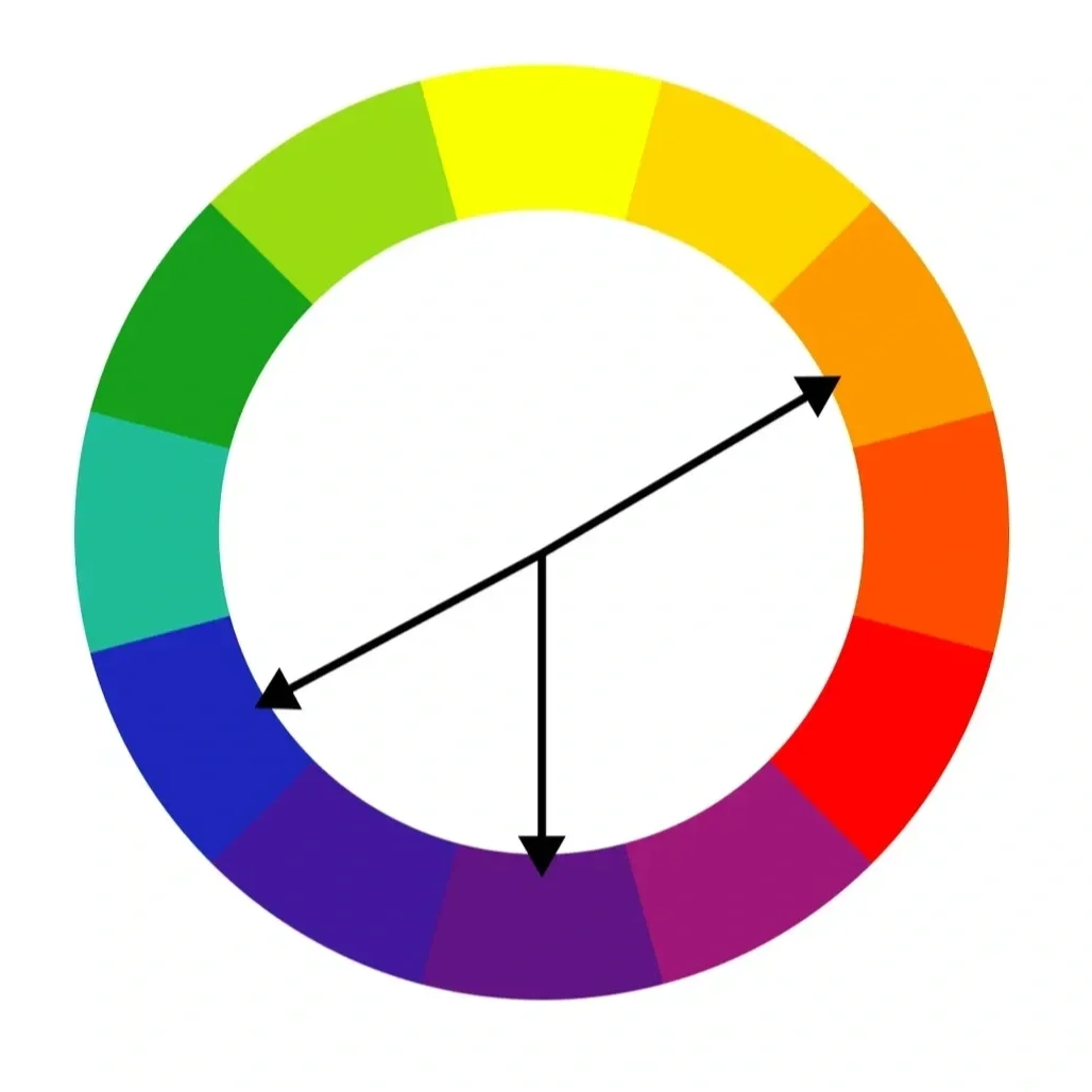
During our strategy call, the client and I landed on four words to define the brand identity: Trust, Mentor, Community, and Empowerment. Researching the Portland real estate market, I noticed most competitors overlooked orange, while red, white, and blue felt oversaturated, and I avoided the obvious regional cliché of green. Orange's color psychology, happiness, energy, elevation, speaks to homeowners navigating an overwhelming, financially stressful process. Since the audience skews millennial, I added nostalgic touches like film grain and 90s-style imagery to create a sense of comfort.
Strategic color
Researching the Portland real estate market, I noticed most competitors overlooked orange, while red, white, and blue felt oversaturated, and I avoided the obvious regional cliché of green. Orange's color psychology, happiness, energy, elevation, speaks to homeowners navigating an overwhelming, financially stressful process.
Initial Sketches
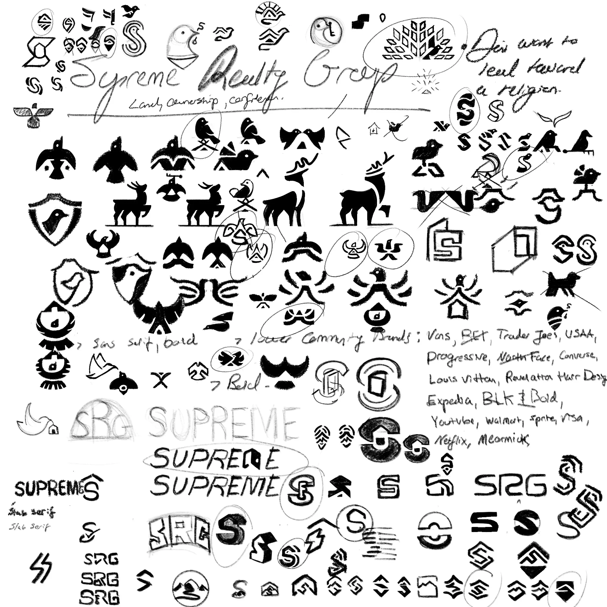
For the initial logo sketches, I explored many different directions—from animals to custom letter forms and wordmarks. This process helped me align with what the client and I discussed on the strategy call and where I was seeing gaps in the market. Most competitors will use the obvious house mark or a fence with a Letter, but I knew that this was oversaturated. The logo needed to be familiar and convey trust and comfort yet be different.
Visual Identity Breakdown
Based on the sketches, I landed on a logo mark built from an abstract roof shape merged with sun rays. During the initial presentation call, the client hesitated, noting that the mark wasn't immediately clear and expressing interest in incorporating a literal house. I revisited our original strategy conversation to remind them that the mark needed to feel familiar yet distinct, and that a logo isn't meant to function as an illustration or explain the entire business; that responsibility belongs to the brand as a whole. This mark strikes that balance: familiar and comforting, while standing apart from competitors like Zillow, Redfin, and Own It Northwest.