


UI / MOTION GRAPHICSEditCo Bio
EditCo Bio revolutionizes biotechnology by providing cutting-edge engineered cell solutions. Through precision genetic engineering, EditCo Bio empowers researchers and industry leaders in drug discovery and regenerative medicine to accelerate discoveries, drive therapeutic development, and advance global health. As one of three designers on the account at SmartBug Media, my responsibilities were: UI, Illustrations, and motion graphics to help explain complex engineered cell solutions.
-
Co-designed the UI and page system with another designer, from layouts to HubSpot modules
Created custom illustrations of EditCo's cell products and the science behind them
Designed and animated the motion graphics, including concept animations, transitions, and micro-interactions
Set the rules that tie color, illustration, and motion together, with lavender marking what changes
Designed responsive layouts for desktop, tablet, and mobile
-
Explaining gene editing to experts without oversimplifying it or burying them in text
Showing products that are far too small to photograph
Earning credibility for a new company with no existing web presence
Keeping motion useful, not decorative, on content-heavy pages
Designing for a product catalog that would keep growing
-
Launched a complete website for a company that started with none
Complex science is shown visually, so visitors grasp it before reading the specs
One consistent language across UI, illustration, and motion
A modular HubSpot system the team can extend as new products launch
A responsive experience that works just as well on a phone as on a desktop
The Challenge
Every new therapy, drug screen, or disease model starts with cells that behave the way researchers need them to. EditCo Bio makes those cells, engineering knockout and knock-in cell lines, edited iPSCs, and primary cells so scientists can spend less time building models and more time running experiments. Spun out of genome engineering company Synthego, EditCo launched with deep scientific roots and no website at all.
EditCo needed a web presence built from the ground up, one that could explain complex gene editing to a skeptical, highly technical audience without burying them in text. The science behind their products happens at a scale no camera can capture, and a page full of stock pipettes and glowing helixes was never going to earn a researcher's trust.
Drawing What No One Sees
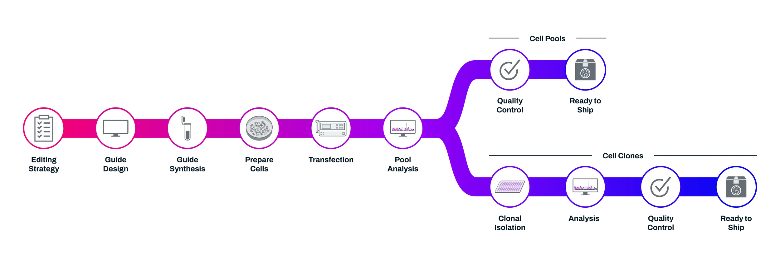
You can't photograph a gene knockout. Stock imagery of pipettes and glowing helixes says "biotech" without saying anything about EditCo. So I built a custom illustration set that shows the actual products and processes: cell types, where an edit happens, and what comes back to the researcher.
Scientists will spot a sloppy diagram right away, so accuracy came first and style second. I kept the forms simplified but correct, used lavender only for the edit or the thing that changes, and gave every illustration the same line weight and scale so they read as one family across the site.

Motion that Explains
Biology is a process, and processes are easier to follow when they move. A static diagram asks the visitor to imagine the sequence. An animation shows it: find the target, make the cut, get the result. That became the test for every piece of motion on the site. If it didn't help someone understand something, it didn't ship.

Lab Clean Interface
We built the palette on white, neon lavender, and Oxford blue. White gives dense technical content room to breathe. Oxford blue carries authority for a company asking researchers to trust it with their experiments. Lavender is the signal color: it marks what's interactive and what's being edited, which later became a rule in the illustrations too.
The Solution
EditCo's new website makes the invisible easy to see. A clean palette of white, neon lavender, and Oxford blue gives the site a lab-fresh feel with the authority of an established brand. Custom illustrations / icons show EditCo's cell products and the science behind them, and motion graphics walk visitors through each process step by step, from finding the target to making the edit. Carousels, vertical sliders, and hover animations keep dense technical detail one click away, while a modular HubSpot build lets the product showcase grow right along with the catalog.